Clear navigation
Categories, search and filters help customers navigate the range.
Client project · Electronics · 2026
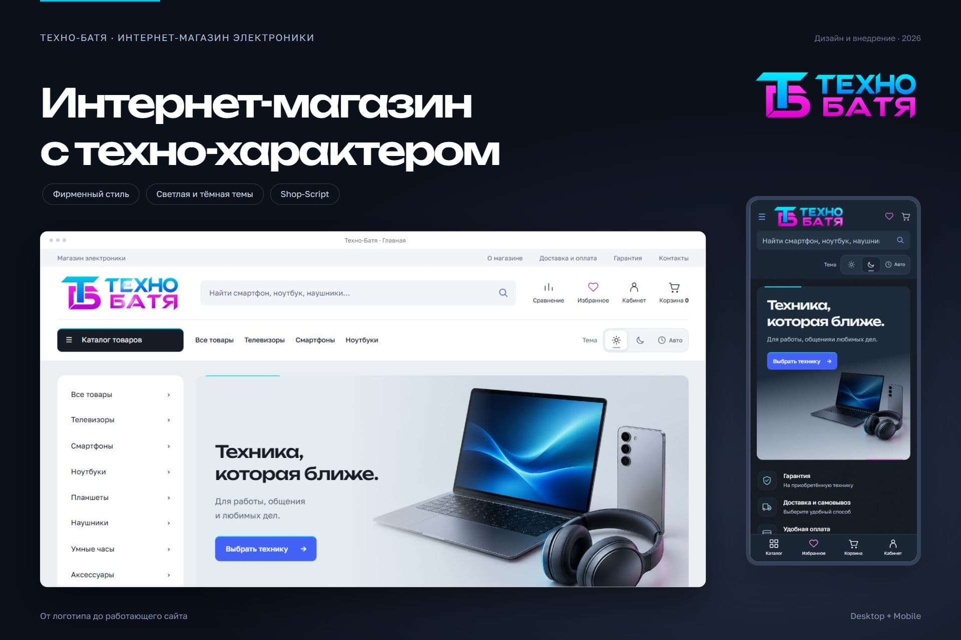
Created the identity and brought it to a working online store. One visual language for the logo, catalogue and every customer interaction.
The brief
The client wanted a recognisable electronics store: a light textured foundation with neon accents. The task was to preserve the platform’s familiar shopping functions while creating a distinct identity.
Visual identity
Cyan and magenta carry the identity. Green highlights purchase actions. The quiet textured background leaves room for products and specifications.
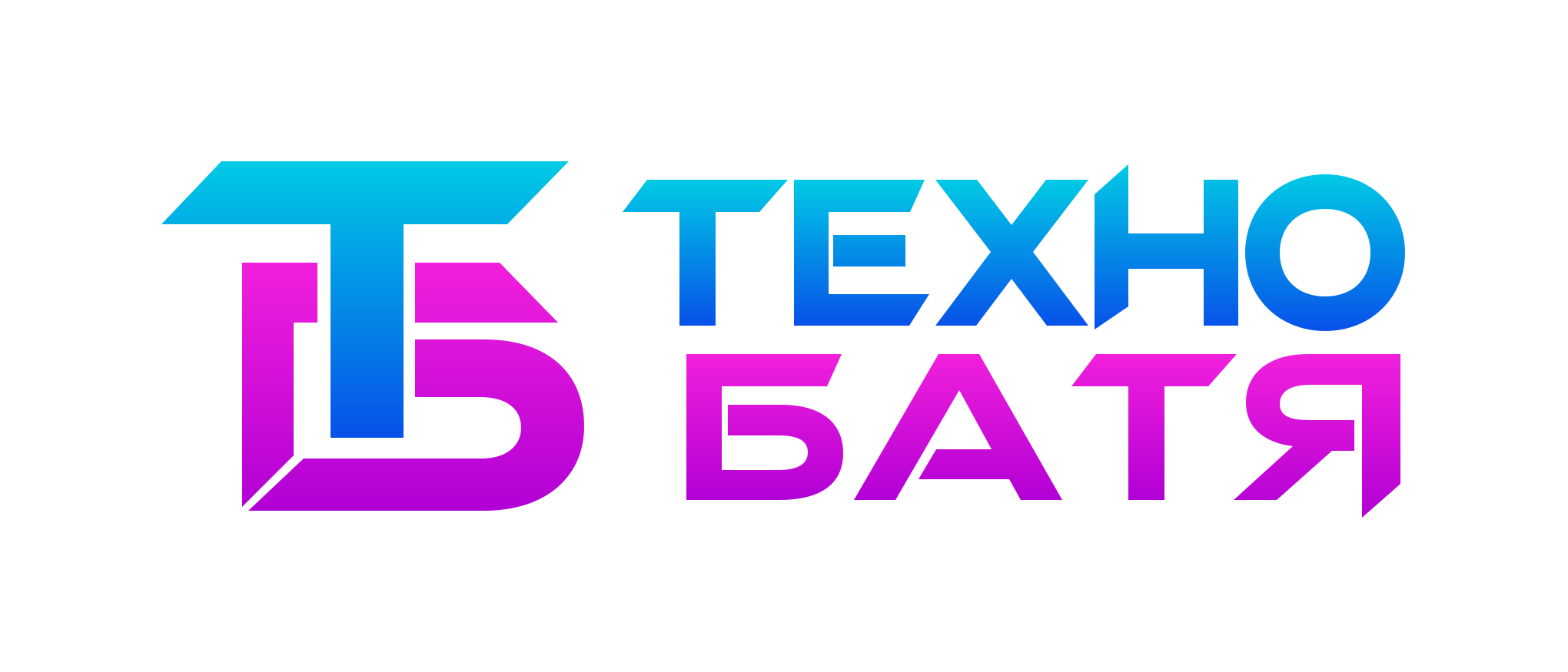 Combined monogram and custom wordmark
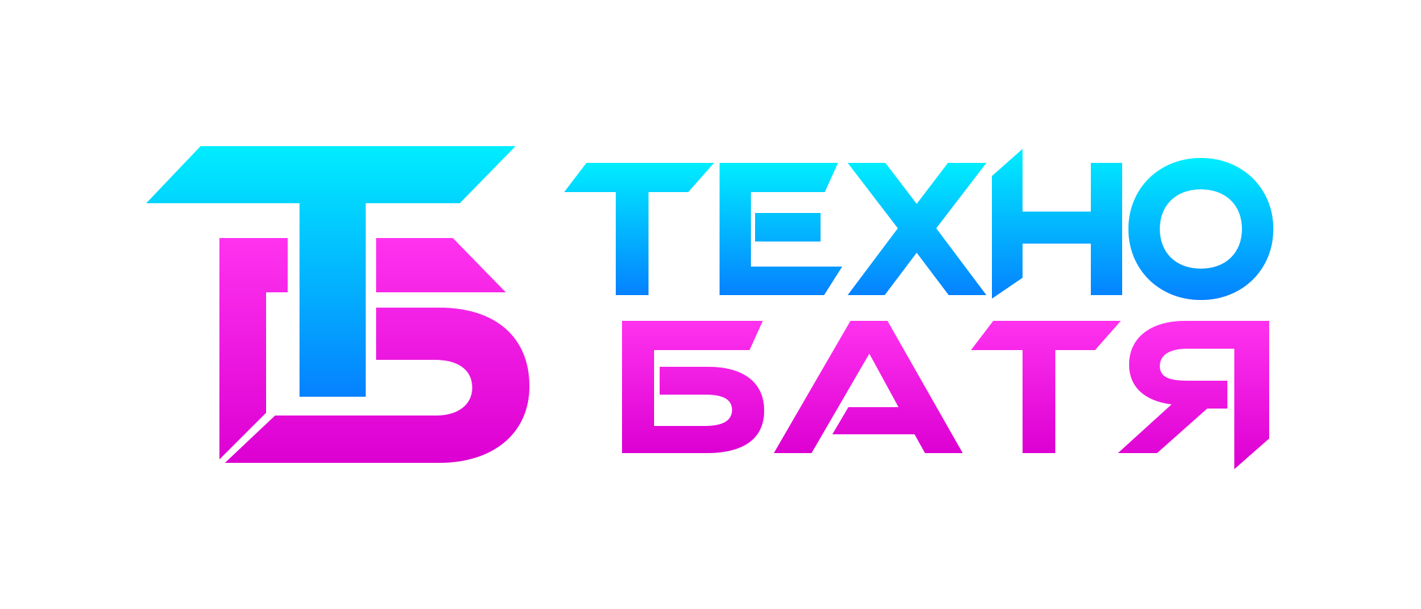 Left-to-right sweep and a subtle glow on dark
Explore the specifications. Compare. Find your match.
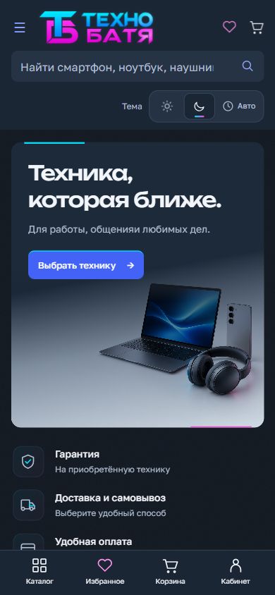
Two themes
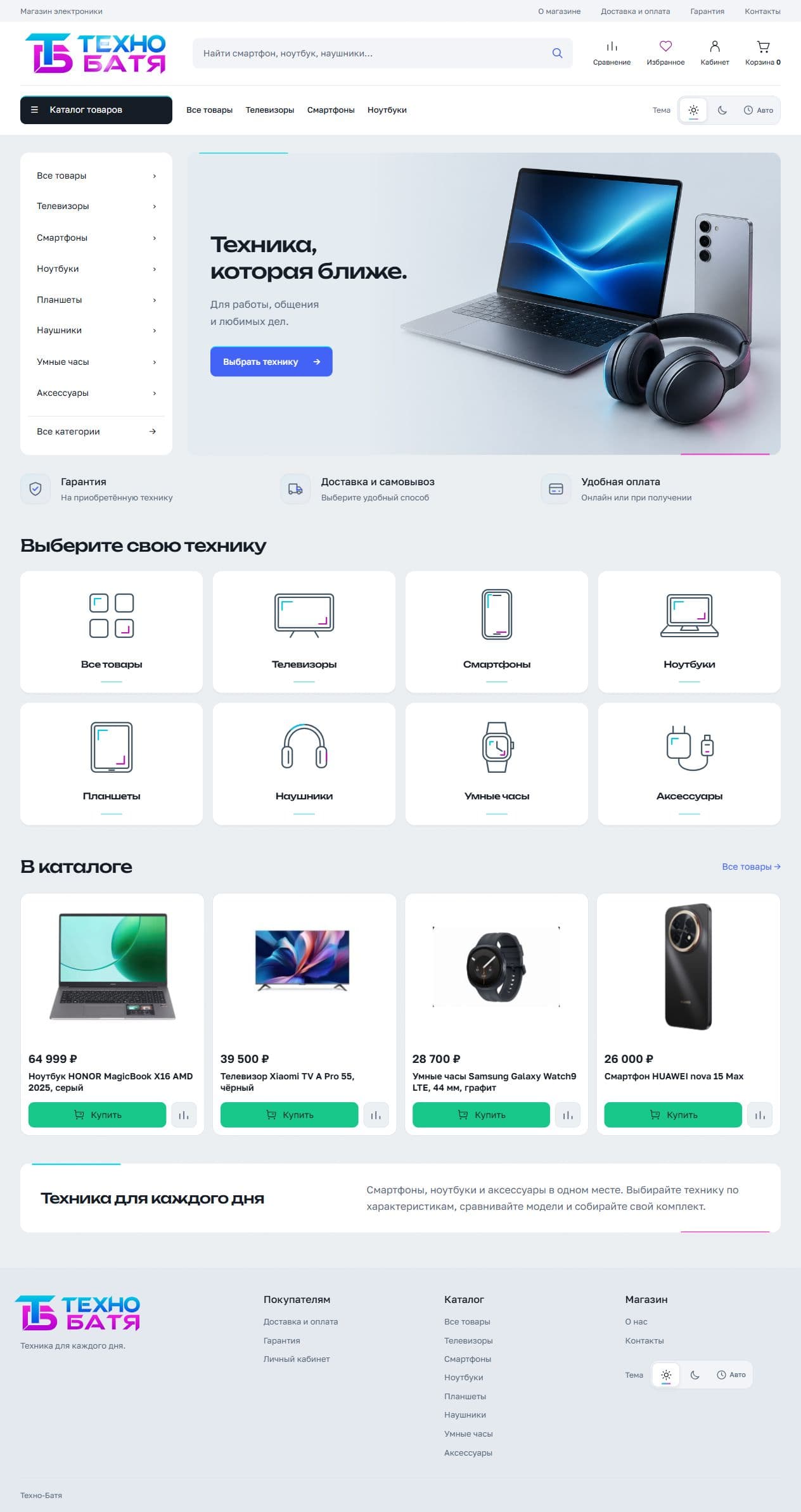
Actual screens from the completed website. The storefront also supports automatic theme switching by time of day.
Catalogue and product
A consistent icon set connects the homepage categories and menu. Selecting a colour updates the device photo. Price and the green purchase button stay together.
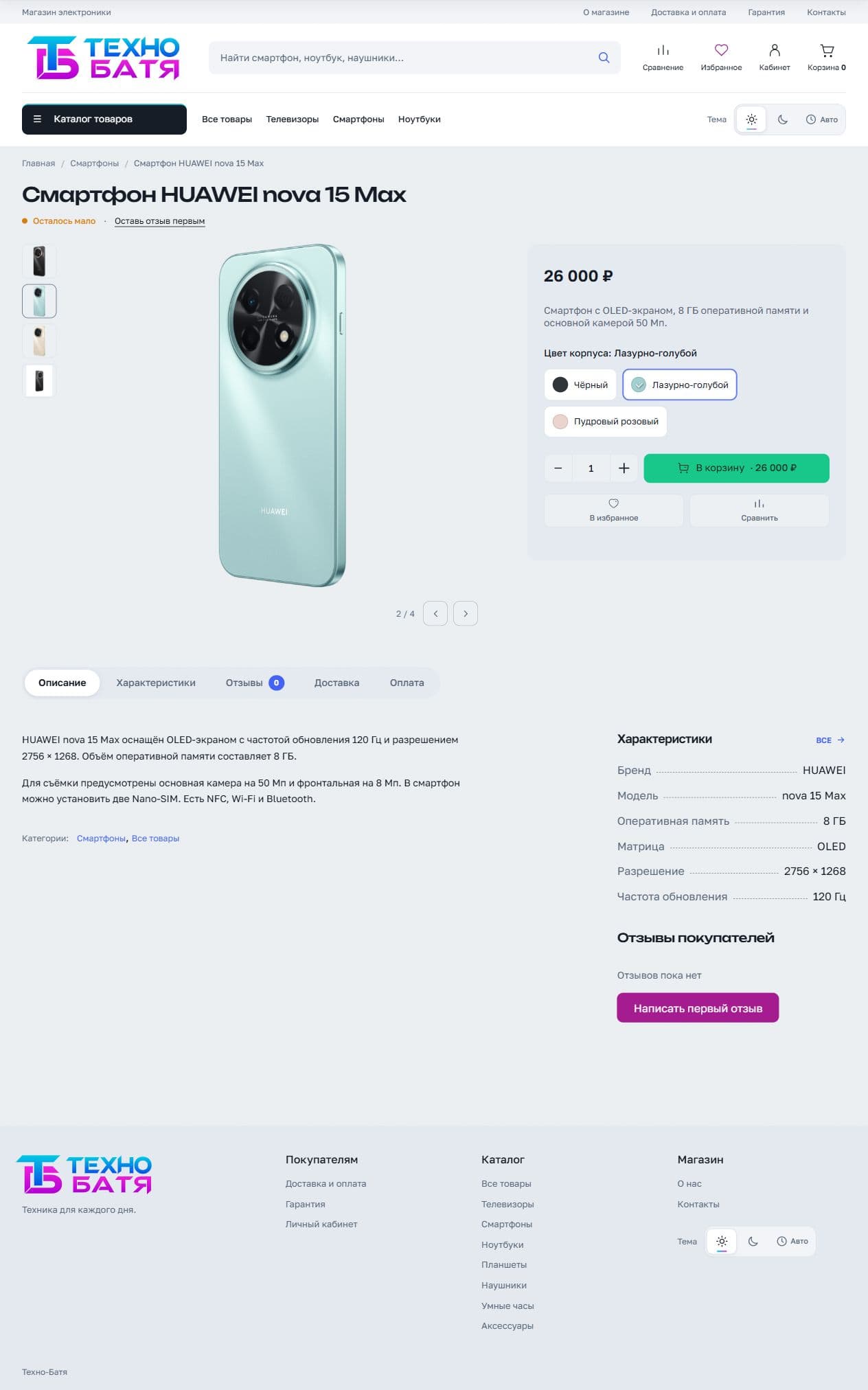
Categories, search and filters help customers navigate the range.
The colour name, selection indicator and matching photo work together.
The cart, account, forms, empty lists and error messages share the same visual system.
Mobile experience
A compact header, generous controls and bottom navigation. Catalogue, favourites, cart and account remain within easy reach.
Try it on your device ↗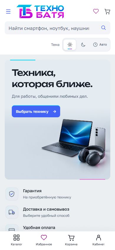
Outcome
The design is implemented in the licensed Tehnostore Premium theme on Shop-Script. Responsive layouts, both themes and core user journeys were checked. The client accepted the work and received the source files and maintenance instructions.
Open the working website ↗Public staging storefront with a demo product range. Commercial payment and shipping integrations were outside the project scope.