Interest and experience first
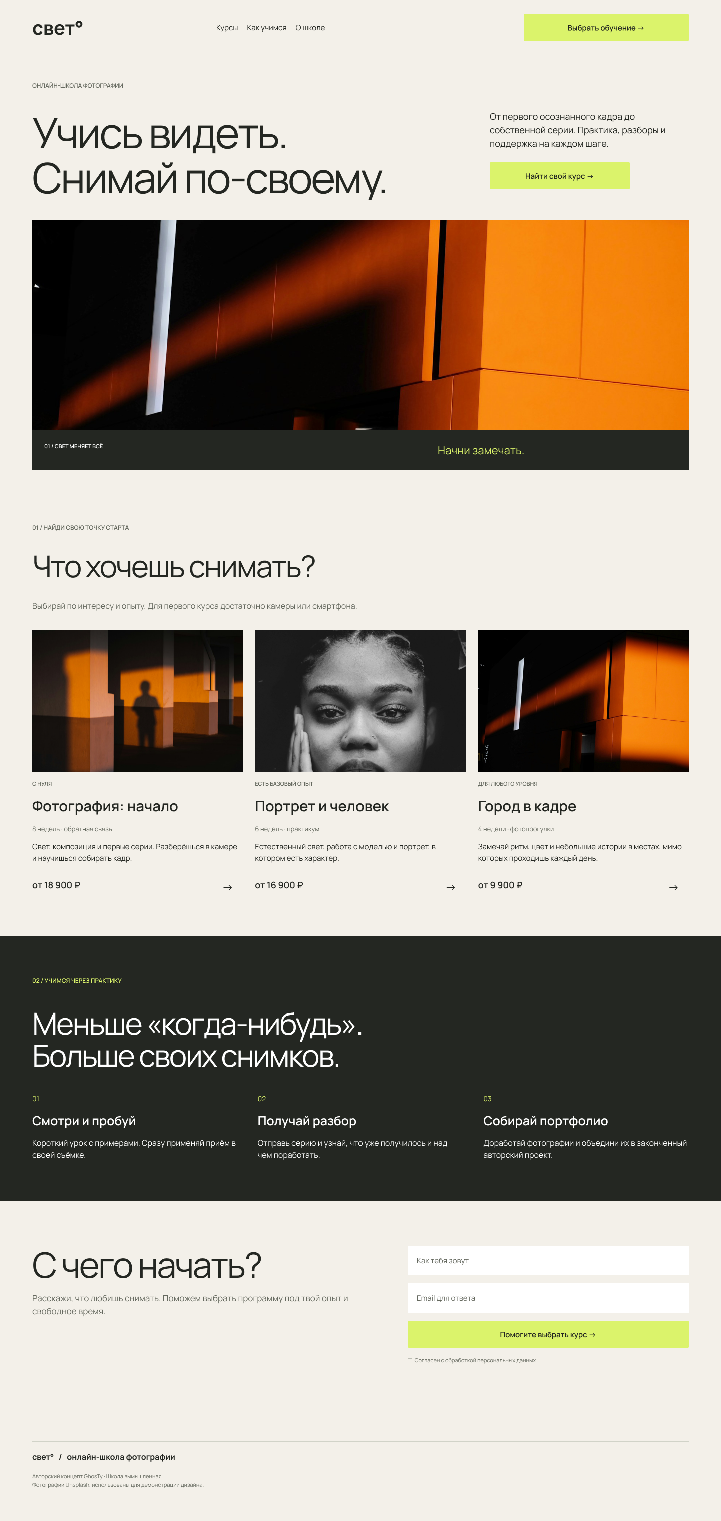
Three paths with experience level, duration, format and price visible on every card.
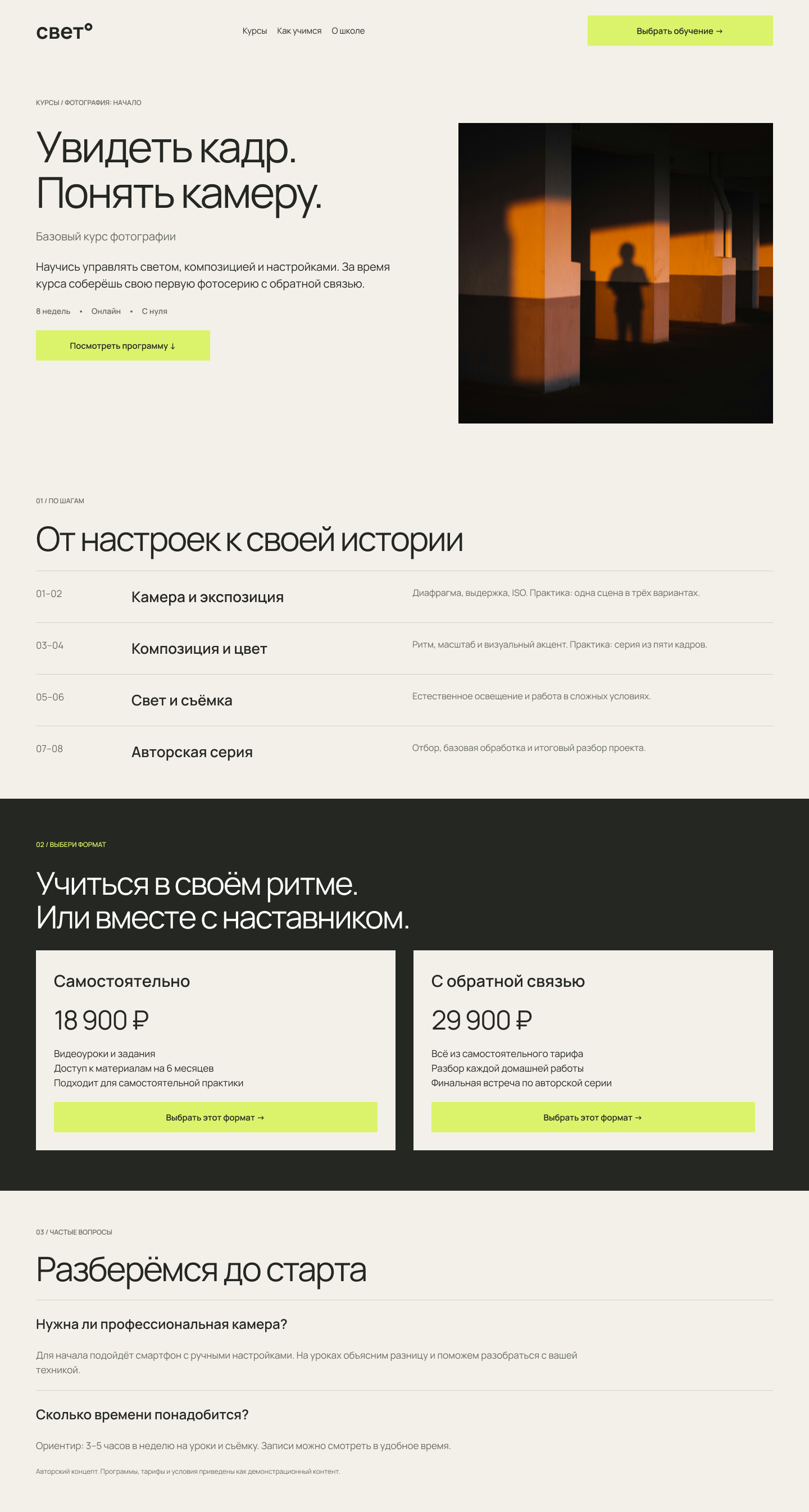
A photography school website. From the first spark of interest to choosing a course and a learning format.

01 / THE BRIEF
A beginner needs to know whether a camera is necessary, how much time studying takes and whether feedback is included. The website answers these questions before enrolment.
02 / THE SELECTION FLOW
Three paths with experience level, duration, format and price visible on every card.
The course page breaks down the programme and explains the practical work at each stage.
Compare two learning formats or ask for guidance. Both paths remain accessible on mobile.
03 / HOMEPAGE
A warm paper canvas, generous typography and a bright action colour. Photography sets the tone while the interface helps visitors choose.

390 px / dedicated mobile layout
04 / COURSE PAGE
The programme, two learning formats and FAQs sit on one page. Visitors can compare prices and inclusions side by side.
Open the editable file →